![]()
It can be tempting to plop your logo onto everything surrounding your business and call your branding efforts done. A strong logo is great, but there are so many more elements that go into a successful brand.
Your brand is defined by the perceptions customers and potential customers have about your product or service. These perceptions can be influenced by the visual elements such as colors (a bold yellow might evoke an cheerful feeling, a quiet blue, a sense of trustworthiness), the tone of your written communications (such as friendly and conversational or authoritative yet approachable), and even the interactions customers have with your employees. The list goes on.
So what are the ways to visually enforce your brand beyond the logo? Let’s look at Target as an example — Target has enforced their visual identity so well, the average American consumer can see just a few seconds of a commercial and immediately know it’s for Target without even seeing the logo. So how do they do this?
- Color. There are countless studies into the psychology of color, and at this point we know people’s feelings about specific colors are largely tied to their own personal experiences and cultures. However, we are learning about the importance of perceived appropriateness of color. For example, if you run a non-profit raising money for refugees fleeing war-torn countries, a cheerful yellow may seem out of place and inappropriate for such a serious mission thus turning off a prospective supporter. Or if you are marketing a product to American men, gender stereotypes aside, studies show they will likely be less responsive to softer colors. Who is your brand speaking to and what feeling do you wish to evoke?
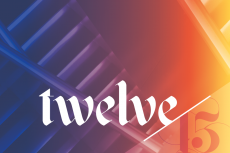
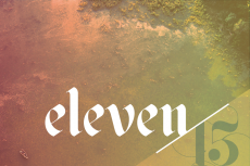
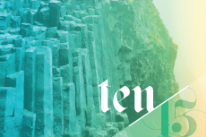
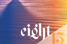
- Typography. Fonts can be playful, serious, impacting, decorative, casual. The appropriate font can help communicate your brand’s mission. Serif fonts originally evolved from the calligrapher’s hand so these fonts are largely seen as more traditional. Sans-serifs came on the scene later and therefore tend to be seen as more modern. Let’s take a look at the message below. Each says the same thing but the fonts help to convey a different feeling. Which feeling do you wish to convey?

- Imagery. While we could technically house your brand’s full visual identity under the umbrella of “imagery”, let’s focus on patterns and photography here. U.S. researchers found that the human brain can interpret images in just 13 milliseconds, making it one of the fastest ways to connect a prospect to your brand. Are you using photos that tell a story? What feelings are being evoked? Do the colors compliment your brand colors?
For Target, the use of patterns, their unmistakable red, and supporting colors all work together to establish their bold and energetic visual identity. Over the years they’ve been able to make subtle changes while still keeping a cohesive aesthetic.
It takes time and many interactions to establish a brand in the minds of their customers. A logo is just one piece of the puzzle; using color, typography and imagery effectively and consistently is an important part in achieving a strong brand.
So even if you are not thrilled with organization’s logo (and maybe for good reasons), you can still build a strong brand by leaning more on the other elements that form your organization’s visual identity.
Need ideas on gathering new leads for your business? Download our free ebook on the 30 Greatest Lead Generation Tips, Tricks & Ideas.